The Canberra Raiders have revitalised their logo and brand ahead of what is a new era for the club in 2020 and beyond.
Following on from the success of making the 2019 NRL Grand Final, the Raiders have reworked their logo in collaboration with local creative agency Inklab, with the updated logo contemporising the current Viking head, wordmark, typeface and colours.
The changes coincide with the teams move to their new high-performance centre in the heart of the Canberra City in Braddon, with the new Raiders Centre scheduled to open ahead of the 2020 season.
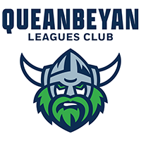
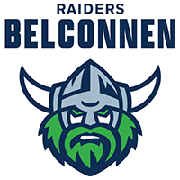
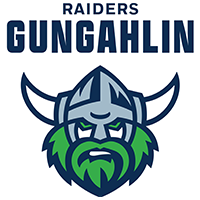
The Raiders Viking head - our brands’ primary mark, has been simplified, with tweaks to its fine details to make sure it looks great in any format or location.
The colour palette has also been simplified from six to five colours and refreshed to include the ‘Green Machine Envy’ and ‘Bad N Mean Navy’, both of which have been utilised in previous seasons.
The club’s wordmark has also been modernised, to better reflect Raiders brand we know today.
“We’re excited to share these brand updates. It’s been 20 years since the Raiders logo was last updated,” said CEO Don Furner.
“The new look logo allows us to continue to have a strong, unique and highly recognisable brand in 2020 and beyond, particularly digital, without straying too far from what everyone knows and loves.”
The new logo will feature on the Club's 2020 apparel, at the new Raiders Centre, while the Raiders website and membership packs will also feature the fresh look.
The Raiders logo was last updated in 2000.
For more information on the new brand visit www.weareraiders.com.au